Student lifestyle brand at the University of Illinois.


Champaign’s Finest
A lifestyle brand for the social side of student life. Founded solo in 2017 and run over five years, with some gaps in between. The brand itself “graduated” in 2022.
- 5
- Years
- 8,000+
- Peak followers
- ~$30
- Paid advertising
Aug 2017 – May 2022, in seasons
Instagram, organic
Total, across the full run
Act 01
The Brand
A lifestyle before it was a product,
and the students who lived it.
The idea
In the work-life balance, school is the work. This was the life.
I graduated in May 2017 and spent the summer applying for design jobs. One company wrote back, to say no. What was left was a retail job with nothing to do with design, or spec work on sites where ten designers answer a brief and one gets paid. Both meant designing to someone else’s idea of good. A Complex Blueprint episode on Bobby Hundreds changed how I looked at it. I had been designing shirts for clubs and Greek life since I was a student, so I decided to make my own, for the audience I knew. That fall it cost me nothing, and for once I had something to design.
Most Illinois merch came from the bookstore, a navy or orange tee that says Illinois, and that was the safe option everyone took. The bars, where students spent the other half of the week, had a logo on a shirt at most. The bookstore covered the work half. Nobody was designing for the other half, and that is what I wanted the brand to be.
I was living at my parents’ house, three hours away, so the first pieces went to a few younger friends still on campus, people who were out a lot and would be seen wearing them.
The gap
The off hours had merch. You just had to be in the group to get it.
A fraternity or a club would make a shirt for its own event, and you had one if you were in it. As a student I designed a lot of those through Campus Ink, which paid me ten percent, about two dollars a shirt. A good group design sold a hundred times, so one design was worth about two hundred. Owning the line changed the math. A one-sided DTG tee cost about twelve dollars to make and sold for twenty to twenty-two, shipping charged a little over what it cost, and each garment left eight to twelve dollars. Group shirts stopped at the edge of the group. A line sold to everyone did not.
Greek life, the bars and the social calendar kept campus interconnected, and the people who went out spoke the same lingo. Nobody had made it into a line you could just buy.
Group orders came back later, and they showed what the line traded away. A hundred shirts for one event is one big sale with one deadline, and when a print came out wrong or a box arrived short, I paid to fix it before a date that could not move. The line gave that up for one shirt sold many times, and the freedom to design what I wanted.
Name
I named it the way streetwear names itself.
The first names on the list were Money Block, after the game days students spend at the bars from 11 AM instead of tailgating, and Mass Limited, for a lot of designs each released in small runs. Both were a streetwear brand looking for an audience. What I had was the reverse, an audience I knew, waiting for a brand, and the name had to say where it was from.
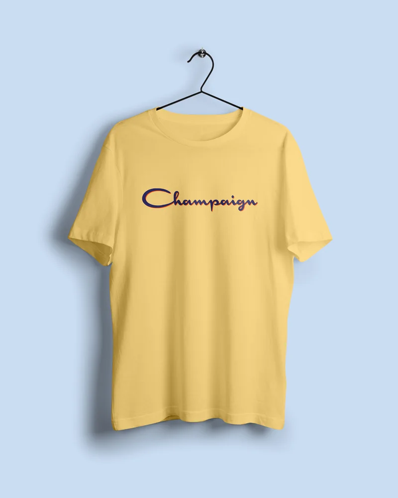
I started from how the brands I was looking at were named. Supreme and Champion tell you the person wearing them is the best. Off-White does two things at once: it is a color, and it puts the brand between streetwear and high fashion. Champaign Champion was on the table, but Champion was taken. Then the Kobe shirt from the Life of Pablo tour, with “Lower Merion’s Finest” on the back hem, gave me Champaign’s Finest, which reads as a streetwear name and as top quality at the same time.
Only after choosing it did I remember I had written it once before. In March 2017 I designed an Unofficial shirt with Champaign’s Finest along the back hem, a concept that never got printed, six months before any of this started.
The other reading came later, and from other people. In most cities the finest means the police. It was never the point, but I kept an answer ready. Here the best and brightest were the students, and the tagline said it outright. You are Champaign’s Finest.
Three words
Gregarious. “Quintessent.” Zeitgeist.
The brand was a lifestyle with a lot of moving parts, and explaining it in full tended to lose people. These three words are my way of condensing it, the shortest version of a definitive take on the most popular things in one hyper-local place at one moment. Sayings people used became words on garments, and sometimes a design was just the thing that happened that week. The words are uncommon, so each one comes with its definition.
- Gregarious
- Of crowds. The public half of a person rather than the private one.
- “Quintessent”
- From quintessence. The pure extract of a thing. Who someone is once the responsibilities are done and the tie comes off.
- Zeitgeist
- The spirit of a place and a time. Everything happening now, gathered into one word.
In their words
I never had to explain the split. They explained it back to me.
In the last year of the run I messaged people who had been buying for a while, campus reps, friends who became customers, customers who became friends. I asked them to describe the brand as a feeling, and then how it compared to the bookstore. Four years in, the answers kept arriving at the same line I had started from.
What I had not put into words myself was the difference. The bookstore shirt was the one you could wear to class or be photographed in without explaining it. It filled a need. CF was a want.
- “I mean, those are illinois shirts. It’s school vs recreation.”
- “Your store is for people who have school spirit but for the campus bars.”
- “You go with your grandma or parents on the first day of school and have them buy you a generic UIUC shirt… Champaign’s Finest is something made by students for students.”
- “Yours are more organic and real. Bc it’s actual students making it and their experiences.”
Act 02
The Branding
One mark everyone knew, and a system flexible enough to restyle it.
Mark
Two letters locked into one shape, the way Louis Vuitton does it.
Louis Vuitton was the brand I studied closest, from its mark to how its site shows product. Its monogram sets two letters on top of each other until they read as one shape, and that shape reads as a house mark instead of somebody’s initials. I overlapped the C and the F and slanted the pair. An upright CF looked plainer, and it still turned up where a different style fit, like a Giants-style version tried for hats and jerseys.
For the type I went through every typeface on my computer, in the monogram, a one-line wordmark and a stacked lockup, and landed on Hoefler Text small caps. A serif, on purpose. Everything about the mark was reaching for the look of luxury and of money, so people would see value in something new and be willing to pay for it.
For the first two years the profile picture pushed it further. A decorative cut of the mark drawn like the engraving on a dollar bill, fine lines and all. Money is the thing everyone already reads as valuable, and a brand nobody knew yet needed to borrow that value. Once enough of campus knew us, the borrowing could stop, and the profile picture changed to match the site each month. The engraving lived on in the hatched lines through the diamond behind the letters.

The wordmark. The monogram on the hero is the same two letters.
Imagery
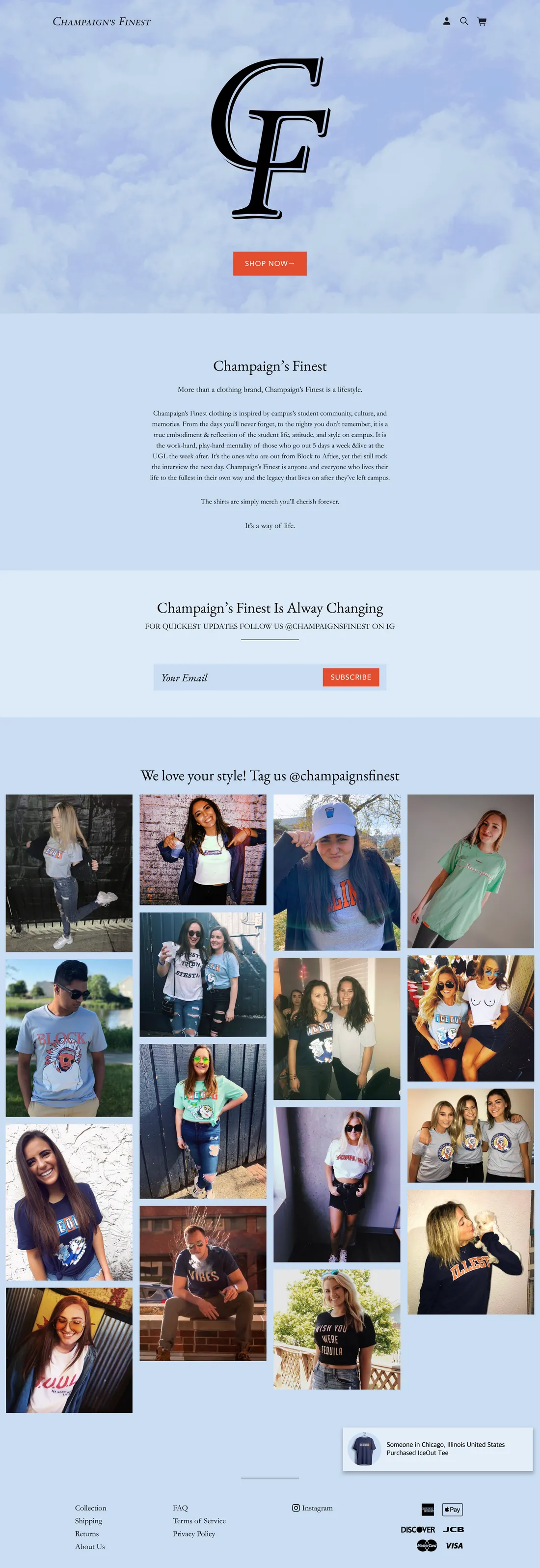
Campus photos made some students think it was the university’s.
The first site leaned on the campus itself, the Quad as the hero and posts of the Union and the bell tower in navy and orange. It made the connection instantly, and as the brand grew, some students took it for the university’s own, a marketing office trying to be cool. I only heard it years later, in the third and fourth year, when the account had moved on to memes and people wrote in to say they had assumed it. We were never associated with the school at all.
Before there were photos of anyone, I mapped designs onto stock models in plain tees, then moved to a mockup kit I still use. Model mockups always looked fake. The real thing was people on campus posting the merch, and saying yes when we asked to repost it.
There were four shoots. Each one was a three-hour drive each way, a couple of hours walking campus to shots I had planned around reflections and shadows, a friend on the camera while I directed, and an evening of editing after. The cost was the drive, a free piece for every model, and the people who canceled at the last minute.
The last shoot was April 2019. When the account turned to memes that fall, they did far better than photos of people in the merch, and the shoots stopped because the account no longer needed them. The site moved to mockups and collages of the merch, with customers’ own posts pulled in from Instagram at the bottom of the page.
One monogram. A new colorway every month.
The point was to have something new every month. From fall 2019 through February 2020 the logo, the banner and the site all changed color together, each month in a color that fit it. The reference was MTV and the Google doodle, marks that get redrawn constantly and stay recognizable the whole time. The treatments carried from month to month, thin-line drop shadows and a diamond behind the letters, hatched like the old dollar-bill cut. Twice a year the CF became a CP, for Champaign Problems, the name that came second when I was choosing and the brand’s way of saying campus has a dark side too. During the 2020 shutdown the two letters split apart with a six-feet marker between them.
It stopped because the catalog outgrew it. Product mockups were JPEGs on a solid ground, for file size and load speed, so a new site color meant re-exporting every design in every garment and every color by hand. Black and white themes made that manageable, and the cloud blue ended it, a ground that never had to change again.
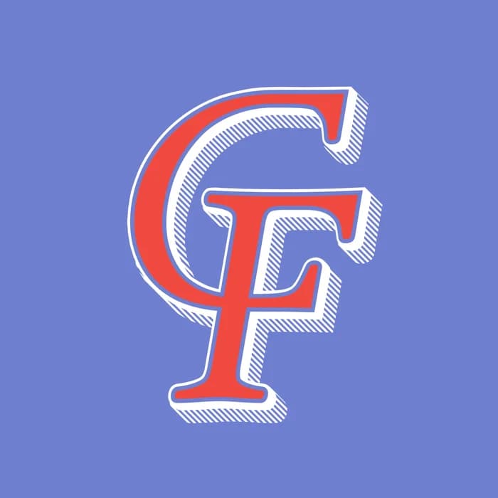
Periwinkle
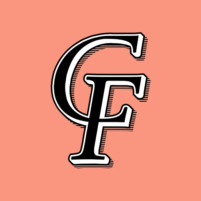
Salmon
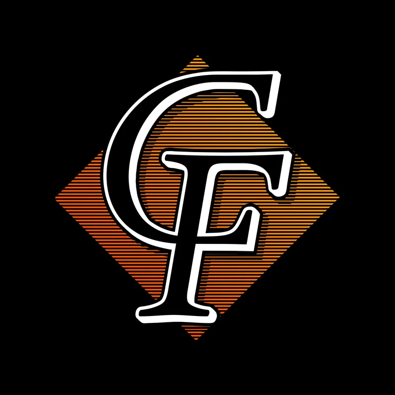
Orange fade
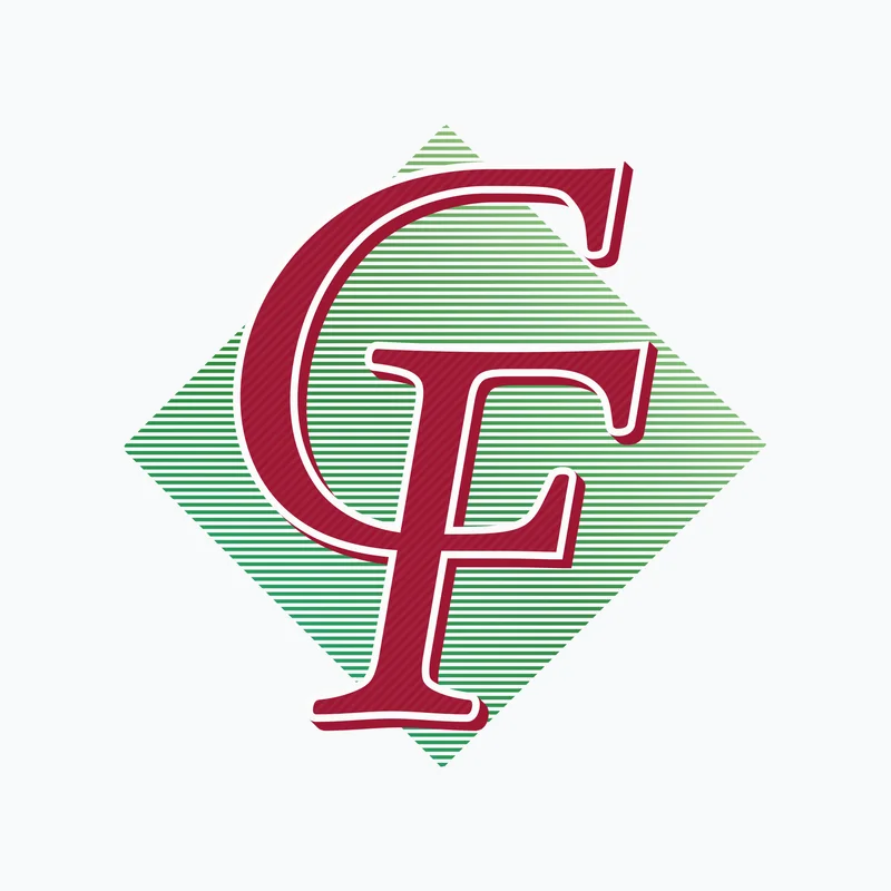
Holiday

Gold on black
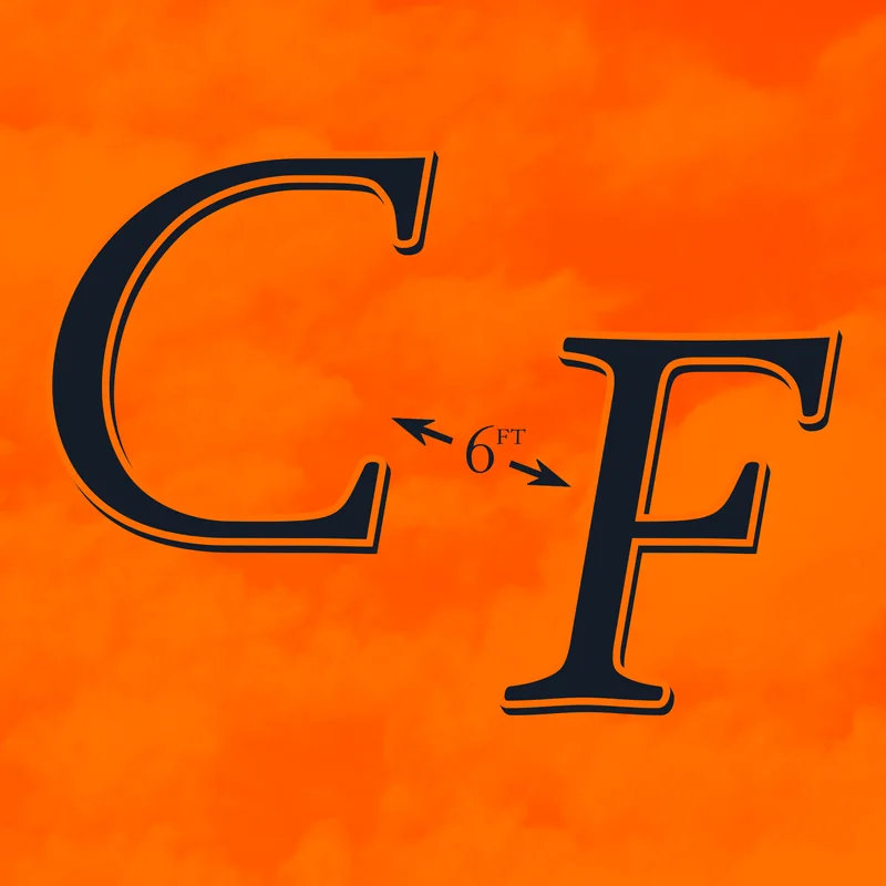
Spring 2020 · six feet apart
Palette
Always the school’s blue and orange, in the brand’s own shades.
2017–2019
Salmon
#FB957F
Illini orange
#E84A27
Navy
#13294B
White
#FFFFFF
2020–2022
Cloud
#CADDF3
Orange
#D75742
White
#FFFFFF
Black
#000000
I started from the school’s colors on purpose. Navy and orange are what campus reads without thinking about it, and the colors made the connection for people immediately. I did not want the brand to rest on the university’s exact colors, in case that ever caused problems, so it needed one that was ours. Salmon is that orange pulled into a pastel, the kind of color Greek life already wore, the Vineyard Vines pink kind of thing. Of the shades I tried, it was the one that looked most like its own.
Those four were the brand colors on paper. In practice the monthly colorways ran the palette, and whatever the month called for is what the site wore. The early navy, burnt orange and golden yellow never went away, they moved into the merchandise instead, every cartoon character in yellow sunglasses and every school-spirit design in the school’s own navy, orange and white.
Where it settled was the cloud blue with one warm orange against it. Blue because it reads as trustworthy, far enough from the university’s navy to be ours, and pastel enough for an audience that wore pastels. The orange is a blood orange near the school’s, picked inside the print gamut so the orange on the site and the orange on a shirt were the same orange. It held there for the last year.
Act 03
The Merchandise
What a vendor could do, and what I could charge, decided everything that got made.
Garments
At thirty dollars, the thing in the box had to feel like it.
A Gildan long sleeve with a print on the front and the back landed over thirty dollars before I made a cent. If I was going to ask thirty, or thirty-five, or forty, then the thing in the box had to feel like that. That is what moved the ladder, and the funny part is it barely cost me anything: twenty cents here, a couple of dollars there for embroidery. What the better blank bought was the confidence to hold a price I was already charging.
Printful first, then Appliq, for the custom sewn tags, which made a print-on-demand shirt feel like it came from somewhere. The margins were about the same and the trade was in what I gave up. Appliq couldn’t do embroidered hats at the price or the quality, so hats stayed behind at Printful, along with the phone cases and totes and drawstring bags Printful had grown into. Colors narrowed too: their Bella+Canvas long sleeve came in navy, grey, black and white, so anything orange or green meant dropping back to a Gildan. The appliqué work the company is named for never happened either; everything stayed DTG.
Leaving print on demand is where the risk changed. Cut-and-sew through a vendor on Alibaba meant minimum order quantities, and the smaller the batch the more each piece cost. I wanted small batches anyway, because I didn’t know which items would sell. Order fifty or sixty, sell twenty or thirty, and the rest are yours: drop the price far enough to move them and take the loss, or keep them and take it anyway. The bucket hats left me about eighteen. Fifteen of them are still in a bag somewhere.
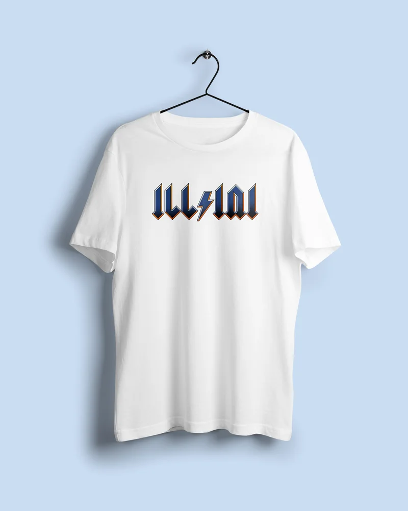
Jerseys
One sample each, because at that price you only get one.
A sample ran about $120 from a manufacturer in Shenzhen I found through Alibaba, and we only ever ordered one of each. The sample answers two things a mockup cannot: whether the factory can build what you sent them, and what happens to a design once it stops being a flat file.
On the first baseball jersey I set the lettering big across the chest, and on the line sheet it looked right. On the finished garment it kept going, wrapping around the torso from one side to the other instead of sitting across the front. That is how I learned the safe area on a jersey, how much room embroidery and pinstripes really need before a design starts running off the body.
Once the sample told me what was true, I built a mockup as close to the physical garment as I could get and put it up as a pre-sale, priced under what the item would sell for later. That did three jobs at once. It raised the money to buy the batch, it told me how many to order, and it told me which sizes to order them in.
Some samples never became anything. The interest wasn’t there, and finding that out for $120 is cheaper than finding it out for sixty pieces. The black basketball jersey and the blue and white baseball jerseys shipped. Champaign 11, which puts the campus skyline where Patagonia puts a mountain range, got a sample and stopped. A Fighting Illini concept stayed a concept, drawn for what the teams might wear if the people who live there made them.
Store
Leaving it open all the time didn’t sell more. It just sold quieter.
Big Cartel on the fifty dollars, a base plan capped at three items. By that October there was enough coming in to choose between a bigger plan and the jump to Shopify, which took the cap off and gave the brand a store it could design.
Then the rhythm changed. When everything was available all the time, there wasn’t much interest, a few sales here and there. I started aiming at the windows where attention already existed, October and the end of the school year, and building toward a release instead of selling through one. A drop opens, there is a window to get it or miss it, and the people who missed one are the first ones back for the next.
I can’t tell you it made more money. Spread across the year it may well average out the same. What it definitely bought was time: no obligation to have a new design every Friday, so the weeks between drops went into the page, the brand, and testing ideas on the campus reps before anything got printed.
Act 04
The Social
An audience built on content, a store one layer down, and the part that ended up mattering most.
Cadence
The Instagram feed sold nothing. The Instagram stories sold everything.
Nothing in the feed was a product. It was whatever was happening on campus that day, the weather, a game, an event, posted while it was still happening. Faster than the official accounts could move, and close enough to the day that people checked the page for it. Students in the library found out it was snowing because of the page, not the window.
Selling happened one layer down, in the stories. Polls there asked what people wanted, products were built from the answers, and drops were announced there and nowhere else, so following the page was the only way to know. In the last few months a text-message list went a layer further down again, and got the releases first.
Reps
Three was the number that worked, and I had to learn it twice.
It started with three: one person I knew would be good at it, and two friends who asked. The arrangement never got more formal than it sounds. I send you pieces, you wear them out, you send a photo back, I post it. That is what the industry now calls user-generated content. At the time it was asking people you know for a favor and giving them a shirt.
It grew because photoshoots need bodies. By late 2018 I was putting calls out to followers for models and reps and we were up around six or eight, and that group was built on friendships and history. When the friendships went sideways the team went with them. That was the first time the brand stopped.
The restart was a new group entirely, three people who reached out on their own in early 2020, and they carried the whole Campus Ink run. Afterwards I tried to grow it again, up to about ten, and got the same lesson in a different shape: pieces lost in the mail that I paid to replace, bundles sent out for a rep to share that went to exactly one friend, people who took the merch and sent nothing back at all. I cut it to five or six, then to the three who brought ideas.
Growth
Both ads worked. I never bought a third.
The growth was the content. The shift in October 2019 started when a campus bar everyone knew was announced to close, memes to save it went everywhere, and football season carried it from there. The account went from about 800 followers to more than 4,000 inside a year, and it was still climbing when I closed it, at a little over 8,000.
$20
Late 2017 · FacebookThe platform’s minimum radius, five miles. In Champaign, that radius covers all of Campustown and every vertical-stack high-rise where students live.
$5
Spring 2019 · SnapchatA geo-filter on the field beside the stadium, three hours. The stadium proper would have been $150. The field hosted a student concert with touring artists in that window. The filter got hundreds of uses.
A few more dollars went elsewhere, ~$30 in total. Everything else was organic.
Both of those worked, and I still never spent more. There was no budget to risk, because money went into garments where it had to go, and I didn’t know how to run ads properly. The two that landed were closer to reading a map than to skill. Mostly though, I wanted to design things and was learning to run a business while doing it, and given a choice between marketing that felt like work and marketing that felt like posting, I took the posting every time.
Traditional channels also want traditional advertising, and what I had was content people would pass around on their own. The five-mile radius and the field beside the stadium are the same instinct as the memes: put the thing where the attention already is, and pay as little as possible for the privilege.
The choice
In 2020 a choice had to be made, between saying something and business as usual.
Most accounts went with business as usual. Students were asking for the opposite and wrote in to say so. The first case was Covid. People were going out sick, and the account said, plainly, take the masks and the distance seriously so that everyone could keep going out at all. Later it carried what student groups asked it to carry, a march date, a form that reached someone who could act.
Every one of those posts read as politics to someone. The replies were consistent: if you post this you must believe that, I follow this page to have fun, stop pushing propaganda. Then an unfollow, sometimes a block. The cost was legible and immediate, which is what made it a decision rather than a post.
The decision was made as a group. The campus reps felt what the students writing in felt, and the brand said what it believed. Others shared those posts to their own stories, and on those days the account lost fifty to seventy-five followers and gained a hundred to a hundred and twenty-five.
Purpose
The merch was the product. The community was the value.
A shirt is a luxury, not a necessity. What the brand stood for was the thing people bought into, and the garment was how you wore it. The play half of student life has a cost the school half never posts about, feeling a year behind, having gone out instead of studying and blaming yourself for it. Over the years, and through some of my own, mental health became what the account was for. Students asked the university for support and got a brochure of places to look elsewhere, so the account posted the campus groups running the events, and where to go. People sent in what had happened to them.
None of it was the business. Two of those positions did reach the catalog, in the last collection, and print on demand means a design can exist without ever being made, which is roughly what happened to them. That collection is the one whose profits were donated. Designs and memes had built a platform big enough to be useful to someone, at a point when not much else was, and that was the most fulfilling part of running it. It is why the account stayed open in seasons when nothing was being made.
Act 05
The Business
The decisions with money on them, from a word I couldn’t officially print to the last drop.
Margins
Eight to twelve dollars a shirt. Every decision in this act fits inside that.
Print on demand left me eight to twelve dollars a garment depending on what it was, and that number set everything else. A tee had to land between fifteen and twenty-two, a long sleeve between twenty-five and thirty, because that is what I would have paid as a student and students were the whole market.
The ceiling turned up as soon as I wanted more from a design. A print on the front and the back is not a DTG job, it is screen printing, and screen printing is priced by placement and by color. Do it and the shirt has to sell for thirty-eight or fifty, which is not a student price. Either the designs stayed simple, or I found a way to be worth the number.
Another Illinois alum, running a swimwear brand, wanted to do a collaboration and I said yes. Then I showed them what the net really came to per piece, and they decided it wasn’t worth doing. That was the right read. They kept building and their brand is still running. I had the same numbers and kept going anyway.
High ticket at low volume was always the other road, and it took until the jerseys in late 2020 to get there. Part of that was the math and part of it was me. Making the same category of thing forever stops working, and a better made object is the honest way to ask for more money.
Constraint
A brand made of local references keeps running into other people’s trademarks.
Nearly everything a campus has in common belongs to somebody. The university’s name and marks, a bar’s name, a beer, a team. Print on demand made the garment cheap and the rights were the expensive part, so the brand spent five years designing around them.
What changed across those years wasn’t the law, it was how findable we were. The bigger the audience, the more a borrowed reference was worth someone’s attention, and I got noticeably more careful the bigger it got.
The tell is in how the biggest players do it. A sports network will post a clip from a sitcom to make a joke about a game, and the sitcom is always one that network owns. The people with the most to lose are the most careful about whose material they borrow. That is the entire calculation, in one habit.
Unofficial
The shirts people wanted said one word, and someone else held the trademark.
Unofficial St. Patrick’s Day is a student-invented holiday on the first Friday of March, since the real one is during spring break. It is a day full of drinking that most of campus takes part in some way, plus plenty of people visiting from off campus. Like Halloween or Christmas, it has its own merch. Some people buy a shirt that says UNOFFICIAL, and some just wear anything green.
Turns out, someone held the trademark on the word. I had designed Unofficial shirts through Campus Ink as a student, so I didn’t expect it. The morning after my first designs went up, an email arrived asking for a cut of gross, on terms that would have left me in the red.
What made it possible was a partnership I already had. The October before, I had gone to Campus Ink for manufacturing and come back with a white-label arrangement: they printed, and I stayed the owner. Their owner shared the rights to the word, and a pop-up drop with them that winter hadn’t landed, so Unofficial got the focus.
Campaign gross
$7–10KThe campaign’s total, not mine.
My net
~$1.5KAfter the split with their student design team.
A full year, early on
$5–12KFor scale. The first two years sat at the low end, the third at the top, and the last ran slower. A specialty launch grossed $1,200–2,000.
The full storyHow the partnership worked, the pop-up that missed, the run-up to Unofficial, and what it cost meOpenClose
I went asking for a manufacturer. I came back with a partner and a job.
I had known one of the owners since my junior year, back when I was making shirts for my fraternity and for whoever else needed them, the Polish barn dance, the Irish Illini, the skydiving club, the bars. When I wanted to restart the brand on better margins, I knew who to ask.
It worked for them too. They wanted real work for their student designers, and a brand to put it under. On my side it became a job: design for their other clients, a small salary separate from anything the brand sold, and a marketing funnel built out of years of email addresses they had collected.
What they had
The rights to print the word and, as a licensed vendor for decades, the university’s name and Greek letters. A screen-printing shop, bulk manufacturing, and a store on campus. Until then I’d been print-on-demand, which meant thin margins or high prices. Their unit cost meant I could sell cheaper or keep the difference.
What it cost
Minimum runs of 40–50 with no guaranteed sell-through. Real inventory risk, for the first time.
A drop announced the night before is not a drop people are waiting for.
Two months before Unofficial, a separate release: nine Illinois-licensed pieces tied to the basketball season, printed in their shop and sold in their store at an on-campus pop-up, on better garments than the brand had ever used. It went out the night before with a teaser video, on the theory that a big game and next-day merch would carry itself.
The rush didn’t come. Demand of that kind gets built, teased, then shown, so people know what is coming and why they want it before they are asked to buy. The drop I agreed to ran on a shorter clock than that, and it is the clearest thing the partnership taught me.
Ten days to sell, then half a week to print every order and hand it over.
The Unofficial conversation started in December, because when I designed for it as a student, selling started in early January. First, Campus Ink’s owner wanted to see whether one of their largest clients, a bar owner, wanted a piece of it, and that took weeks. Then he went to a few on-campus marketing groups for student designs, another week and a half to two. When he came back, he expected designs to be ready. I had waited, as asked.
I made a few, and a student who worked at Campus Ink tried some in his own style. His worked. He knew what would print well, and his designs were simpler than mine tended to be. He was paid for them.
By then the window set itself backwards from the date. Everything had to be worn on the day, so the sale ran ten days and the remaining half week went to production and delivery, with the print shop working around the clock. They also over-ordered blanks and printed a few extra for their own store, which covered the orders that went wrong. A few did.
The cost was mine, and it is the kind of thing you learn early.
Twice in a few months, with the pop-up and with Unofficial, I wanted the relationship to work, so I took the version of the plan they were comfortable with instead of pushing the one I thought was right. Licensed designs had the whole brand under a microscope anyway, so the guerrilla instinct that built the audience had nowhere to go. And there is nothing to show for the rest of the work, because it lived inside their accounts.
I lead with the recommendation now, and say plainly what I think the right call is. Some clients hand over the direction and want to see what you do with it; others want the idea approved before anything gets made, and knowing which one you are working with is most of the job.
Exit
Better to stop it where it stood than steer it somewhere I didn’t want to go.
October and the end of the school year sold; the months between mostly didn’t. One brand tied to one campus calendar has a fixed number of moments in it, and two structures could have widened the window: several unrelated brands with staggered drops, or campus-level franchises under one parent brand.
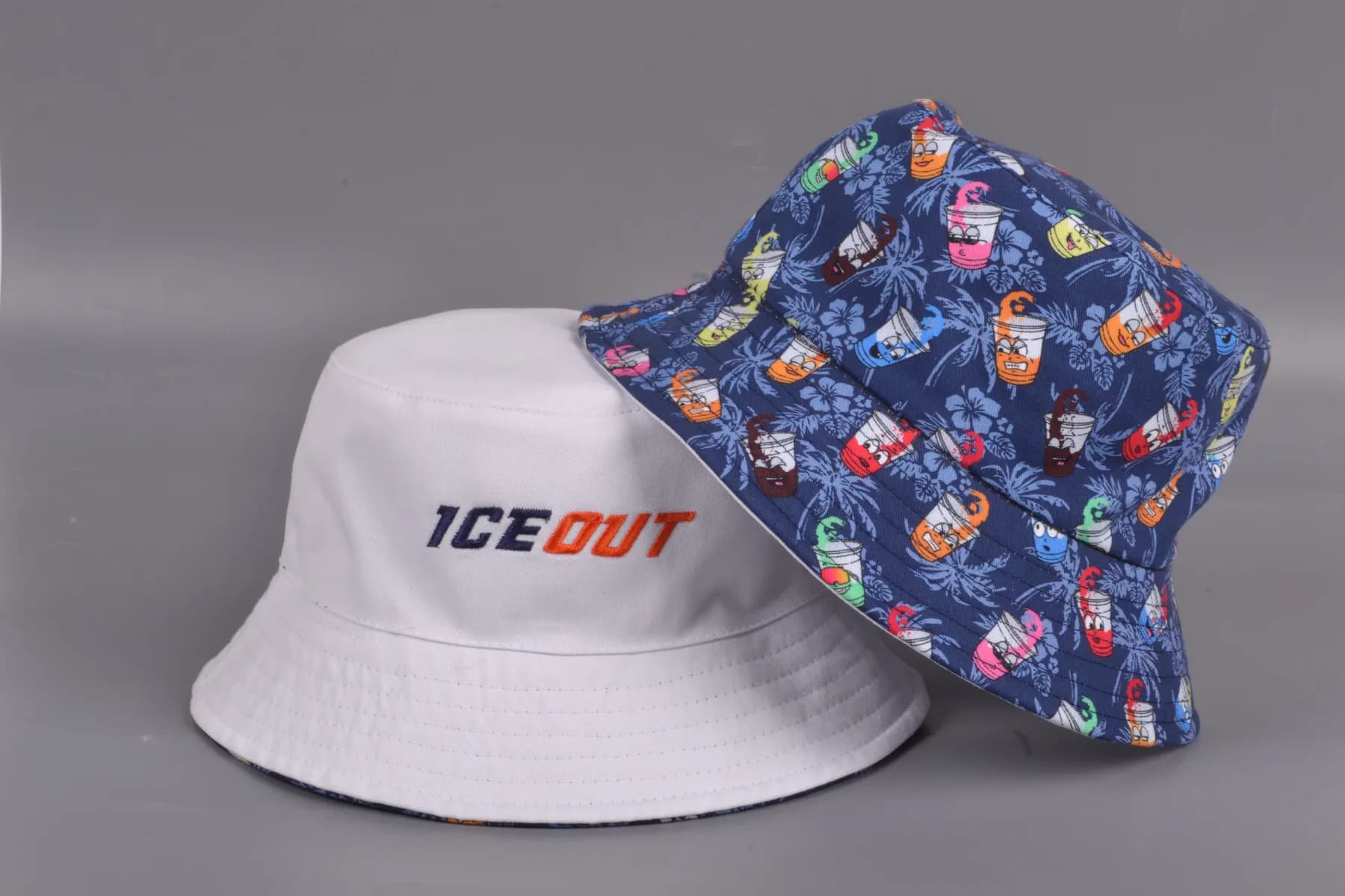
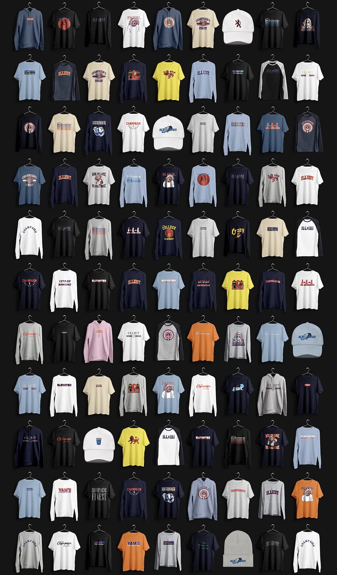
In April 2020 Campus Ink shut down indefinitely for Covid, and the partnership ended over a jersey. The brand went back to being mine. That June the last collection pulled nearly every design ever made into one release and did a little over $4K in three days, with half the net, about $500, going to Chicago-area small-business relief. After that I made only pieces that had to be specially made, the jerseys and the bucket hat in 2021.
The audience was aging into different values, and following them meant a rebrand for a generation I wasn’t part of anymore. The brand is about being a student here, socially, now, and I hadn’t been one in years. I handed the account to the campus reps and announced the end in May 2022. They didn’t take it.
The full storyWhy the franchise had nothing to build on, how the partnership ended, the last collection, and winding it downOpenClose
One brand tied to one campus calendar has a fixed number of moments in it.
I never pinned down why the good months were good. New arrivals in the fall and graduation nostalgia in the spring is a guess, not a cause.
Option one, a portfolio
Several unrelated apparel brands, none tied to this campus or its calendar, with staggered drops so something was always in market and each launch fed the next.
Option two, franchises
A parent brand with campus-level franchises, the way a league has city teams: each school its own local brand, one identity above them, and a general line that travels.
What Champaign gave me was four years of living it and a network still on campus, and the other schools needed both. Nobody wanted to be the local liaison, and when I asked students what their campus’s version of our references was, several had no answer.
Campus Ink builds merchandise for events, and in April 2020 there were no events.
They shut down indefinitely and told everyone to go find other income, so I kept making things on my own. One of them was the Blue Guy baseball jersey. The drink belongs to one bar on campus, that bar was one of their largest customers, and Campus Ink decided to disassociate.
The last collection ran over a hundred designs across short sleeve, long sleeve, sweatshirt, hoodie and tank, 548 product images in all, because every design was mocked up in every color it shipped in.
A tee and a hoodie were things anyone could order; what I wanted were pieces that had to be specially made, which meant batches, which meant drops.
There was not much to wind down.
Almost everything had been made on demand, so there was no warehouse to empty. Sample jerseys went to the campus reps. The bucket hats I gave away to friends, and once, a year or two later, somebody messaged the account wanting to buy a few and I met them in a parking lot to hand them over. I still have about twelve, and two or three sample jerseys in a bag.
I let the domain lapse a few years on, because I was never going to rebuild it and if someone else wanted the name they could have it. The Instagram account I kept. I removed everyone else’s access, archived every post but the last one, and set it to private.
Close
The brand graduated when the students did.
The final post went up the same week the school year ended, shaped like the students’ own graduation posts. Every other post is archived and the account is private now, so what is there is one goodbye and a count of everything that came before it.
There are still around a hundred follow requests sitting in it, from people who could not see anything even if I let them in. The attention moved on the way attention does, at about the speed it arrived.
“It gives me like a nostalgic feeling? Almost like I’m sittin at Lion with a couple drinks and I see people wearing it and it evokes that kind of memory. The good old days I guess.”
“Champaign’s Finest felt like a friend.”